JOIN the AFICIONADOS
To receive our world of travel and style delivered straight to your inbox.
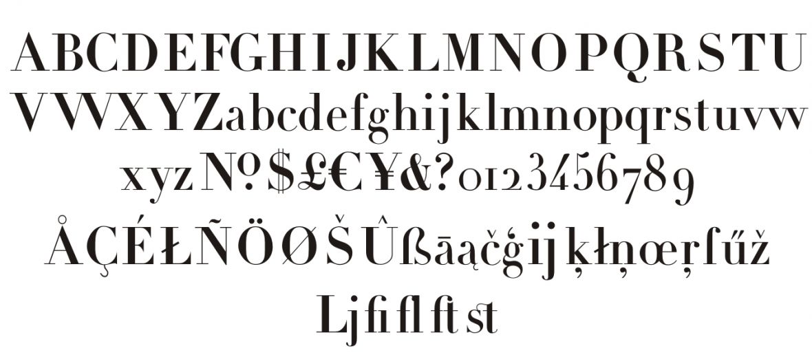
Although today we take for granted the myriad design tools, fonts and typefaces that allow our creativity and imagination to shine through the typed word, have you ever wondered where it all began? Meet the family whose lasting legacy is the font group known, appropriately, as the Didot fonts; typefaces formed during the period of 1784–1811 by a family of book publishers helmed by patriarch François Didot, born in 1730 who owned a bookstore and was famed for his perfection in printing intricate books adorned with maps and engravings. He also invented a new printing press and created a sizing system for the typefaces – a standardised ‘point’ that later became called a ‘didot’ after François Didot himself.
By its third generation, Firmin Didot (14 April 1764 – 24 April 1836) imbued with generations of publishing knowledge and expertise before him, pushed forward the limitations of book and newspaper printing with his invention of a new stereotype, which speeded up printing.
He was also the pioneer who is acknowledged to have designed ‘modern’ typefaces – where thick and thin lines are shaped by narrows serifs on the end of letters, today known as a group of modern typefaces called Didone. He was inspired by the Baskerville font – created by John Baskerville (1706–1775) who made serifs more pronounced, and the letters rounded, moving away from replicating scribe in manuscripts. Firmin Didot develop the font adding more contrast to the strokes and serifs.

In Athens, there is the Didotou Street named after Firmin Didot, who was a passionate philhellene and was one of the first to establish a printing press in the newly independent Greece and typefaces in the style of Didot have remained popular in Greek since. There is even a hotel inspired by his gentle, worldly character, Monsieur Didot in Athens.
His brother Pierre Firmin used the font to print an edition of La Henriade by Voltaire in 1818 – to wide acclaim.
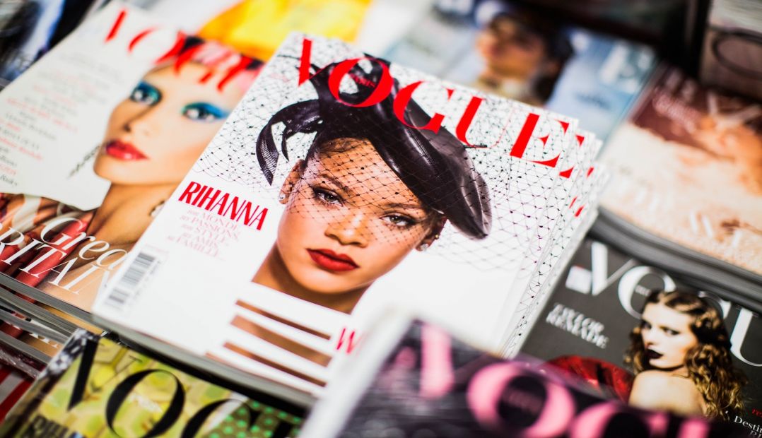
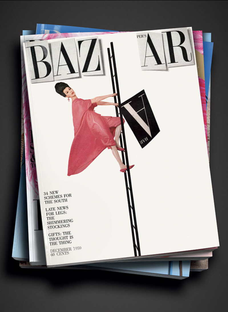
Firmin Didot is credited, alongside Giambattista Bodoni, for creating the Didone (Modern style of Serif typefaces). A modern-day example of Firmin Didot’s discovery, widely-known, is the cover of the magazine Vogue – the title is a modification of the Linotype Didot font. Day-to-day use, choices that influence our decisions in Word are descended from Didot font – those who like classic serifs pick Times New Roman, Garamond and Georgia. Although, like many design devotees, we all have our favourite fonts – and some of us can tell a lot about a person by the font they pick. Fonts - as important in the 21st century as they were in Didot’s day.

Founded as an art platform in 2018 by curator Marina Vranopoulou the objective was two-fold – to give a voice to emerging artists from peripheral countries historically connected to Greece, Greek history and culture.
read more
Radical, sometimes political and always on the pulse of Athens’ ever-evolving art scene, The Breeder Gallery is housed in an old ice cream factory, redesigned by architect Aris Zambicos.
When dealing with one of the oldest buildings in Salzburg, it takes the architect’s clever manipulation of architecture and design to create an exciting, inspiring atmosphere that coverts the old and the new to extreme yet complimentary dimensions.
read more
A city of effortless cool & pioneering Scandi design Copenhagen has long been at the heart of the world’s ceramics stage, from practical to the performative.
read more
Lisbon, Portugal's legendary capital simply bursts with heritage, azulejo tiles, Pastéis de Nata & art - this is a design guide you can shop, see & drink.
read more

Director of internationally acclaimed Vienna Design Week, Lilli Hollein had never yet turned her eye to interior design until Vienna's Hotel Altstadt came knocking.
read more
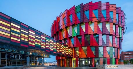
Once considered the “rougher cousin” to Sweden’s pristine harbour-side capital, in the last decade, Gothenburg - or Göteborg to Swedes - has become the country’s west coast hotbed for all things cultural, lovingly nicknamed “Little London”.
read more
Browse our unique Vienna Art Guide below for all there is to know about Austria’s art and culture capital. Once the epicentre of the longstanding Habsburg empire, Vienna is awash with galleries, artists, museums and odes to moments of age-defining culture, as well as a new generation of creatives call this city home, once again.
read more
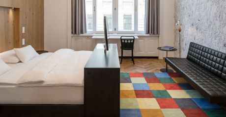
Architect and interior designer Roland Nemetz designs 'his' suite at the boutique Hotel Altstadt Vienna - part of a series of creatively inspired interiors that capture the soul of artsy Wien.
read more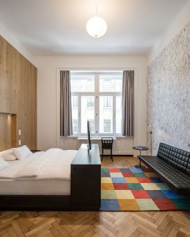
Peek into our Hotel Altstadt Vienna interior design series at room 64, this time designed by celebrated Viennese architect, Adolf Krischanitz.
read more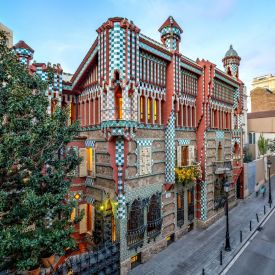
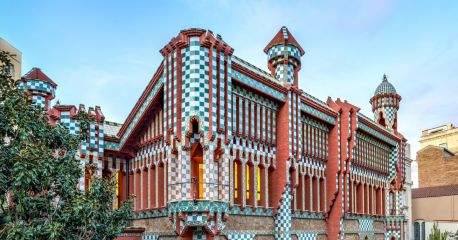
Gorgeously flamboyant, Casa Vicens is a riot of colour and fantastical architectural detailing - bearing the hallmarks of Barcelona hero, Antoni Gaudi.
read more

Porto for culture seekers - we explore the Serralves Foundation comprising of a dusty pink 1930-40s’s Art Deco villa designed by Porto architect José Marques da Silva, a landscape-specific contemporary museum designed by Álvaro Siza.
read more
To receive our world of travel and style delivered straight to your inbox.